Updated June 29, 2025 with FAQs and Key Takeaways sections below.

As an entrepreneur, I do quite a bit of work online. That just seems to be the way everything is headed. I’m fine with that. However, it means I have needed to be creative with selling any of my products. One of the first things I did when I had my first product was create sales pages. These pages were necessary because I needed to draw people’s attention to my products and encourage them to make a purchase—especially through organic traffic. This article does not go into how to generate leads to your sales page.. Today, I am going to be sharing a sales page example to help others be successful with their sales.
What are Sales Pages?
I just briefly touched on what a sales page was. A more in-depth definition is that a sales page is a landing page that is designed to convert visitors into customers. Every element on sales pages is designed to persuade visitors to act and make a purchase.
There are endless options when it comes to elements that can be used. I like to utilize everything from social media buttons, videos, images, copywriting, and customer testimonials.
High Converting Sales Page Examples
Since sales pages can vary from one website to another, I want to share a few different sales page examples with you.
Attention Grabbing Headlines
Headlines are normally thought of as placeholders that make each individual section of a sales page look neat and organized. I prefer to think of these headlines as attention grabbers though.
I have found that so many people don’t take the time to read everything on sales pages. They are looking for specific keywords or anything that stands out.
The bold headlines are one of the things that stand out on any sales page. This is why I make sure every headline on my sales pages will capture a person’s attention. Once I have a person’s attention, they will almost always stick around to read more.
Example: https://website.grader.com/
Open with a “Hook”
Marketing pros call a sales narrative that draws people in a “hook”. Basically, think of it as verbiage that will sink in and grab the reader’s attention.
I like to start my sales pages with a pain point my target customers are struggling with. Knowing that I understand my customers’ main problem always captures their attention.
There are other ways I can accomplish the same thing though. I have also used a unique selling proposition, or USP, which differentiates my offer from any other offer out there. I find this is an excellent sales page example option for those industries that are super-competitive.
My last go-to “hook” is making a bold statement or making the promise that my product has extraordinary value.
Example: https://www.olly.com/
Add Visuals
Visuals can make or break sales pages. I have discovered over the years that all my images and videos must reinforce my sales message 100%. Any wavering, a misspoken word, or unflattering visuals can cost me sales.
Here is a sales page example of how adding the right visuals can be helpful:
Subscription box for dogs – Adding a testimonials section with pictures of the dogs can be helpful on this type of sales page. However, if I were creating the sales page, I would include pictures of the dogs enjoying the items that are sent within the subscription boxes. Potential customers could then see how much fun their dogs would have with those same items. Most of those customers probably wouldn’t even read the testimonials. They would simply focus on the pictures, which would say it all.
Example: https://www.olly.com/
Tackle Those Objections Before They Begin
Everyone has fears when they are looking at products. I would love to say I have heard them all from my sales pages, but I am sure there are others that will pop up eventually.
A few of my favorites include:
- Why does this cost so much?
- Will this actually work for me?
- What happens if I am not happy once I purchase this?
- Why can’t you give this to me for free?
The list could honestly go on and on. I have spent many hours trying to think of all the objections I could before finalizing my sales pages. I only focused on the top objections on my sales pages though. I simply wouldn’t have had enough space if I had added them all!
I like to tackle those objections in the very beginning of my sales page, but briefly. I focus on them a little bit more in detail further down the page.
Hold Off on Pricing
Holding off on listing the price on a sales page until the bottom can keep people thinking about why they need the product. I have found that the more people think about why they need my products, the less sticker shock they will have at the end. Thankfully, I can capture their attention enough and make them understand they need my product with how I create my sales pages.
I have used a sales page example or two from this list for my business. I have found the more of them I use, the better my conversion rates are. For example, conversion rates are high on the Fat Burning Secrets Solutions sales page. So, if you must create any sales pages for your business, use these examples and get your customers to purchase.
FAQs
Q1: What exactly qualifies as a “sales page”?
A1: A sales page is a focused landing page designed to convert visitors into buyers. It uses targeted elements—headlines, visuals, copy, testimonials, and social buttons—strategically arranged to persuade someone to purchase.
Q2: Why should I delay mentioning price on a sales page?
A2: Holding off on revealing the price until later encourages visitors to focus on benefits first, reducing “sticker shock” and increasing perceived value.
Q3: How do you address objections before they derail a sale?
A3: Identify your top customer objections (e.g., cost, effectiveness, guarantees) early and address them briefly at the start, then expand on solutions deeper into the page.
Key Takeaways
1. Hook them early
Use bold headlines and open with a compelling pain point, unique selling proposition (USP), or bold statement.
2. Visuals sell
Every image or video must reinforce the message, not distract—e.g., “dogs enjoying a dog box” is more persuasive than testimonials alone.
3. Objection preemption
List and address the most common buyer concerns early to maintain trust and momentum.
4. Strategic pricing reveal
Delay pricing until you’ve built value; this helps in reducing sticker shock. and visuals.
5. Organic traffic matters
Your sales page should be optimized to attract quality organic traffic as much as possible, using strategies like SEO-friendly copy, relevant headlines, and visuals
Additional Reading:
24-7Press.com: The Power of Guerilla Marketing
LinedIn: Organic Traffic VS Paid Traffic: Why SEO is the Smart Long Game
Want to write SEO copy for your sales page?
SEO Writer for Blogs and Web Content
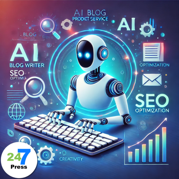
Transform your blogging experience with SEO Writer for Blogs, the ultimate AI blog writer tool. Simply input your topic, SEO keywords, and desired tone, and let the AI craft a perfectly tailored blog post that resonates with your audience and ranks higher in search engines.
NOTE: This is a one-time purchase, providing lifetime access to the service.
Here are some samples written by our AI Agent:
Unlocking the Mysteries of the Zero Point Energy Field
What are Collagen Masks?
See how it works…watch this video:


